Turn an Opus 5.5 product video into a readable vertical edit
Rebuild a 16:9 Remotion video as 9:16 with Opus 5.5: real screenshot crops, stacked layout, subtitle space and downloadable landscape and portrait examples.
 Ofox
Ofox 
A useful vertical edit changes the layout, not just the aspect ratio. With an Opus 5.5/Remotion project, keep the story and source assets, then place the heading, screenshot and subtitles in a new vertical composition. Crop the real interface around the part the viewer needs; do not squash a desktop frame into a phone-shaped box.
This tutorial converts a 30-second product overview from 1280 × 720 to 720 × 1280. It includes both actual exports and an editable project. The new work is in screenshot framing, text placement and output checks; the main Opus video guide covers the broader code-to-MP4 workflow.
Compare the two actual exports
Watch or download the narrated landscape version, then compare it with the vertical edit:
Actual 720 × 1280 Remotion render, 30 fps and 900 video frames. The English reference narration and sentence captions are shared with the landscape version. This is a public-page overview, not a recording of an API request being completed.
Get the complete project and portrait MP4. The archive preserves the real 1280 × 720 source captures and the final crop coordinates, so the transformation can be inspected and changed.
We actually called claude-opus-5-5 in first-party Claude Code to create the initial React/Remotion source. That call received written asset descriptions and dimensions, not the screenshot pixels. We supplied the real images, reviewed the output, made editorial corrections and rendered locally. Opus did not directly output this MP4, and the reference voice was generated separately with eSpeak NG.
Choose re-layout, crop or a new shot
A landscape screenshot has enough horizontal space to show navigation, a central page and a sidebar. A portrait frame usually cannot preserve all three at a useful reading size. Decide which part supports the sentence before deciding how far to zoom.
| Approach | Good use | Failure to watch for |
|---|---|---|
| Fit the complete desktop screen | Establish the page’s identity briefly | Small interface text becomes unreadable. |
| Crop a genuine region | Focus on a heading, control or panel | The crop removes context needed to interpret the claim. |
| Re-layout editorial elements | Keep heading, screenshot and captions separately readable | Copy remains positioned for the old canvas. |
| Capture the actual mobile interface | Teach a real mobile workflow | The article falsely implies the desktop UI is a mobile UI. |
| Record a new interaction | Demonstrate a step that depends on a click or result | A static screenshot is animated to resemble untested functionality. |
Our portrait edit combines re-layout with genuine crops. It does not claim to show the site’s mobile layout. The documentation shot becomes a closer view of its left-side introduction; the API shot keeps the main overview and table. The raw captures remain unchanged.
The screenshot-to-demo tutorial explains how these assets were selected. If you have a real mobile interface, capturing it can be a better solution than enlarging a desktop region. That would be a different source asset, so record its URL, viewport and capture time separately.
Keep one story and two compositions
Install Node.js and npm before running the project. The optional terminal media checks below also require a separate FFmpeg installation, including ffprobe; npm ci does not install that shell command. You can render through the supplied npm scripts without using the optional inspection commands.
Start with the downloaded project:
npm ci
npm start
Select DemoNarrated, then DemoPortrait. Both use the same scene intervals, images and narration schedule. Their layout prop differs. This makes a comparison meaningful: a change in what the viewer can read comes from the layout and crop, not from substituting a different script.
| Property | Landscape | Portrait |
|---|---|---|
| Composition ID | DemoNarrated | DemoPortrait |
| Canvas | 1280 × 720 | 720 × 1280 |
| Aspect ratio | 16:9 | 9:16 |
| Frame rate and duration | 30 fps; 900 frames | 30 fps; 900 frames |
| Screenshot viewport width | 1120 px | 624 px |
| Captions | Bottom band; split column in documentation/API scenes | Separate band beneath the screenshot and chapter row |
| Voiceover | English reference WAV | The same WAV |
Keep the silent DemoLandscape composition when you need a visual-only export. It is a third deliverable in the archive, not a different storyboard.
In src/index.tsx, SCENES owns the cuts at 4, 11, 18 and 25 seconds. Root registers the composition dimensions. Demo selects the layout, while ShotScene decides where to place each image. Changing only Root leaves most of the actual design work undone.
Define the vertical layout in real pixels
Our portrait composition reserves the horizontal region from x=48 to x=672. That leaves 48 pixels on each side of a 720-pixel canvas and gives the screenshot a 624-pixel width. The main content starts near y=110. The screenshot begins at y=330, the chapter row at y=860, and the caption box spans y=936 to y=1060.
These are this project’s design coordinates, not official universal safe zones for every social app. Buttons, descriptions and device framing differ across destinations. Check your destination’s current preview before publishing; this tutorial’s local test is not a platform upload test.
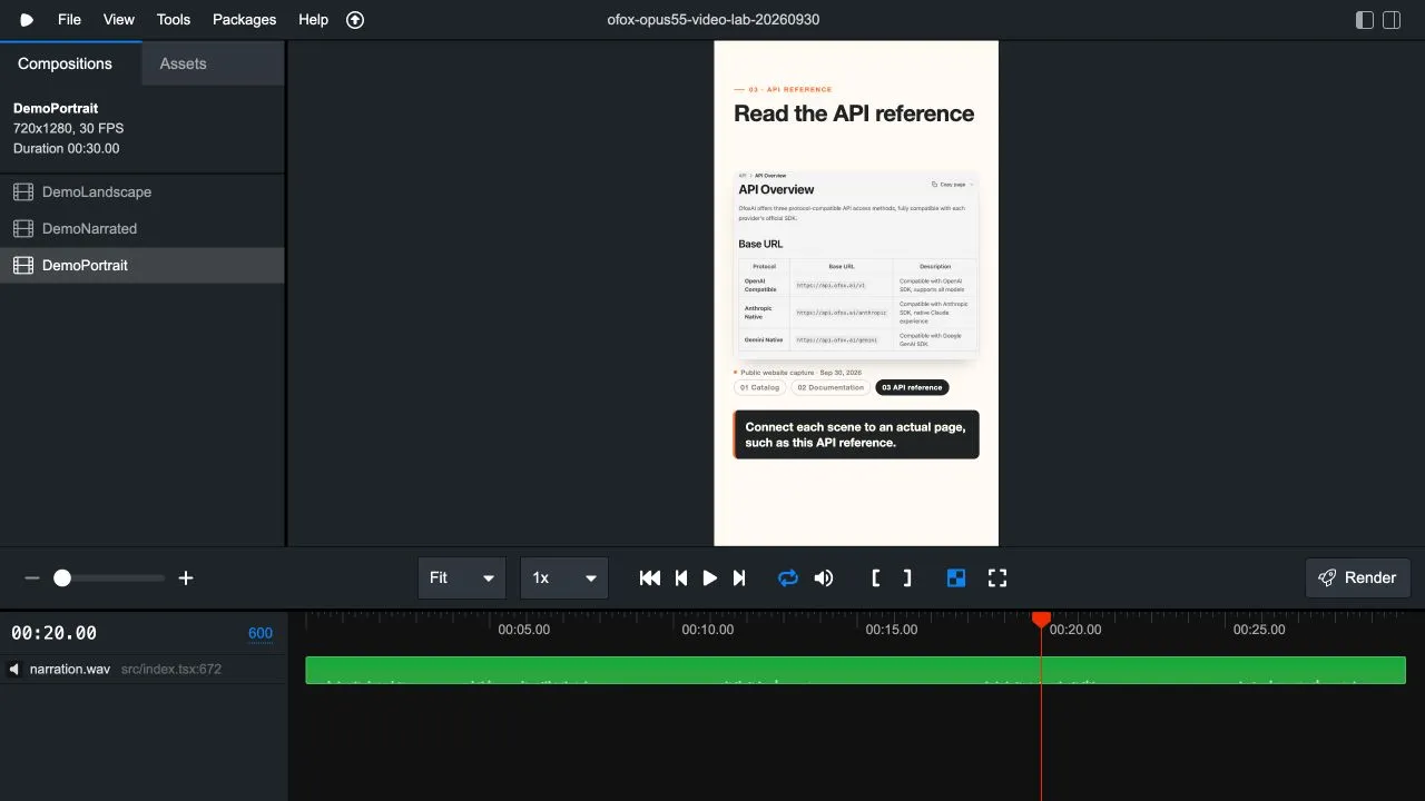
Real local preview. The screenshot is framed independently from the heading and caption. The interface and example video are English; the image has not been rewritten to simulate another language.
The heading can wrap onto two lines without pushing the screenshot into the subtitle area. This matters for “Find the documentation,” which takes more space than “Explore the catalog.” For a different title, check the actual wrapped height rather than assuming that a shared font size guarantees a shared block height.
The API crop is the tallest image in this version. Its height is approximately 479.3 pixels, so it ends around y=809.3. The capture label starts roughly 22 pixels below that. This leaves little spare room before the chapter row, which is why you should not casually increase image height or label font size without inspecting that scene again.
Calculate the crop without distorting the interface
A crop needs four source coordinates: x, y, width and height. Scaling needs one factor for both axes. The final source crops are:
| Scene | Source crop (x, y, width, height) | Portrait display size |
|---|---|---|
| Catalog | (0, 0, 1280, 320) | 624 × 156 px |
| Documentation | (64, 140, 580, 370) | 624 × approximately 398.1 px |
| API overview | (290, 85, 690, 530) | 624 × approximately 479.3 px |
All crops are inside the original 1280 × 720 files. The catalog crop intentionally excludes the changing price section below it. The documentation and API crops preserve actual pixels; they do not recreate text or controls.
For a display width W and crop (x, y, w, h), use:
scale = W / w
viewport height = h × scale
image width = source width × scale
image height = source height × scale
image left = -x × scale
image top = -y × scale
For the API scene, 624 / 690 ≈ 0.90435, and 530 × 0.90435 ≈ 479.3. The image moves behind an overflow: hidden viewport by the corresponding negative offsets. Its width and height still use the same factor, so circles stay circular and text is not stretched.
There is a practical limit: enlarging a crop cannot recover detail that the original capture lacks. In our documentation crop, 580 source pixels are shown across 624 output pixels. That modest enlargement is visible in the source math; it is not a newly captured higher-resolution page. If small text is central to the tutorial, capture the relevant region at an appropriate resolution and test it again at phone display size.
What changed after the first render
The initial model output placed complete documentation and API screenshots into the portrait layout. The render worked, but much of the interface was too small to be useful. We kept the scene order and introduced the two source crops listed above. That is the main visual difference between the initial and final portrait edit.
We also removed a two-line CSS clamp from captions. A clamp makes the box look tidy while potentially discarding later words. It is safer for an overlong caption to be noticed during review and deliberately shortened, split or given more space. The supplied English sentences fit the inspected version; replacing them requires another check.
Finally, captions now come from src/captions.json, produced by the reference-audio script, and appear on or just before the sentence start after frame rounding. The voiceover and subtitle tutorial explains that schedule and its deliberate reading holds. This project has sentence captions, not karaoke-style word alignment.
Do not apply every landscape design element unchanged. In the landscape version, the documentation and API titles share a band beneath the full screenshot. In portrait, title, screenshot, capture label, chapter row and subtitles occupy separate vertical positions. That is a different composition using the same story.
Ask Opus for a reviewable vertical adaptation
Use this as an adaptation prompt for your project. It describes the constraints we found useful; it is not a claim that we ran every possible variation.
Add a portrait composition to this existing Remotion project.
Preserve the landscape composition and approved source assets.
Target: 720x1280, 30 fps, same scene boundaries and total frame count.

Arrange heading, screenshot and captions as separate vertical blocks.
Use these source crops: [x, y, width, height for each approved image].
Preserve one scale factor for image width and height.
Never redraw the interface or change labels inside screenshots.

Design bounds for this project: x=48..672; important content y=90..1080.
These are project margins, not a claim about any platform's safe zone.
Use a separate subtitle band; never hide overflow with line-clamping.
Do not invent word timestamps or shorten the voiceover silently.

Return the changed files, crop calculations and frames to inspect.
Flag any scene where the title, capture label or subtitle no longer fits.
When a model proposes a crop, verify it against the real asset. A visually attractive region may omit the label that makes the screen understandable. When it proposes a smaller font, check the intended viewing size. The acceptance question is whether the viewer can understand the intended message, not whether every element technically fits inside the canvas.
Inspect all scenes, then export both versions
Scrub to representative frames such as 150, 390 and 600 for the catalog, documentation and API scenes. Check the opening and ending too; a long final destination can overflow even when every product scene passes.
Use the visible frame selector in Remotion Studio to inspect the same moment in both compositions. Look for the actual page identity, full caption text, crop edges, heading wraps and space around the capture label. Check the beginning and end of transitions so a spring or camera movement does not push content out of the intended region.
npm run render:narrated
npm run render:portrait
ffprobe -v error -show_entries stream=codec_name,width,height,r_frame_rate,nb_frames \
  -show_entries format=duration -of json out/portrait.mp4
The portrait video’s expected stream is H.264, 720 × 1280, 30 fps and 900 video frames. Its AAC soundtrack can have a small encoded tail beyond the 30-second visual timeline. Compare the actual sentence timing, not just the container’s rounded duration.
| Problem | Why it happens | Better correction |
|---|---|---|
| Desktop page is tiny | The full page was scaled to fit | Crop the relevant genuine region or capture a new appropriate view. |
| Important labels disappear | Center-cropping favors geometry over meaning | Set crop coordinates from the actual interface and sentence. |
| UI text looks squashed | Width and height were scaled independently | Apply one proportional scale factor. |
| Heading reaches the image | A longer title wraps unexpectedly | Give the heading more height or rewrite it without losing the promise. |
| Subtitle covers the product view | Landscape positioning survived the conversion | Allocate a distinct caption band and re-check the tallest image. |
| Font wraps differently on another machine | System font fallback changed | Bundle an appropriate font for fixed typography, then re-render. |
| Platform controls obscure the CTA | Local margins did not account for the destination | Inspect the destination preview and adjust that delivery version. |
Our checks use local browser previews and rendered files, not a physical-device or social-platform publishing test. Before a campaign launch, view the final export at the size your audience will see and inspect the uploaded version. The article’s five localizations do not imply that five separate localized videos were produced.
Deliver an editable format pair
Save the two exports with clear names, keep their matching source project, and note any platform-specific layout changes. That makes a later subtitle or product-screen update traceable. If you replace narration, re-evaluate both layouts: a sentence that fits horizontally may need different breaks vertically.
The Opus 5.5 model page is relevant to generating or revising the project code. Our recorded call used first-party Claude Code; the local renderer and reference speech engine are separate tools. This example is not evidence of an Ofox one-click vertical editor.
For the complete production path, return to the Opus video pillar guide. Use the product-demo tutorial when the source story needs work, or the audio/subtitle tutorial when the new format exposes timing problems. Keeping those tasks separate makes each revision easier to verify.
Frequently Asked Questions
- Can I make a vertical video by swapping width and height?
- That changes the canvas but does not redesign the composition. Reposition headings, choose intentional screenshot crops and reserve subtitle space; otherwise a desktop layout can clip or become unreadable.
- Does this example use a universal social-platform safe area?
- No. Its margins are project design choices for a 720 by 1280 canvas. Check the current destination app's preview and overlays before publishing.
- Are the portrait screenshots generated or rewritten?
- No. The project crops and scales the same real source screenshots proportionally. It does not redraw controls or change interface text to fit the new format.